
Hi, I’m Nhi — I design for people with short attention spans and high standards. In other words, the average modern user.
figma
webflow
photoshop
illustration
indesign
html/css
Leonardo AI
ux pilot Ai
stitch
Relume
lovable

I’m a UX and product designer with over a decade of experience, starting out in graphic and digital design before transitioning into product-focused roles. I’ve worked in-house, at startups, and as a freelancer, giving me a well-rounded view of both the creative and strategic sides of design. My background spans from crafting bold marketing visuals to designing thoughtful, data-informed user experiences for B2B and B2C applications. I’ve led end-to-end design projects, collaborated with cross-functional teams, and contributed to everything from branding to front-end implementation. Blending art, tech, and storytelling, I aim to create digital experiences that not only look great but work beautifully too.
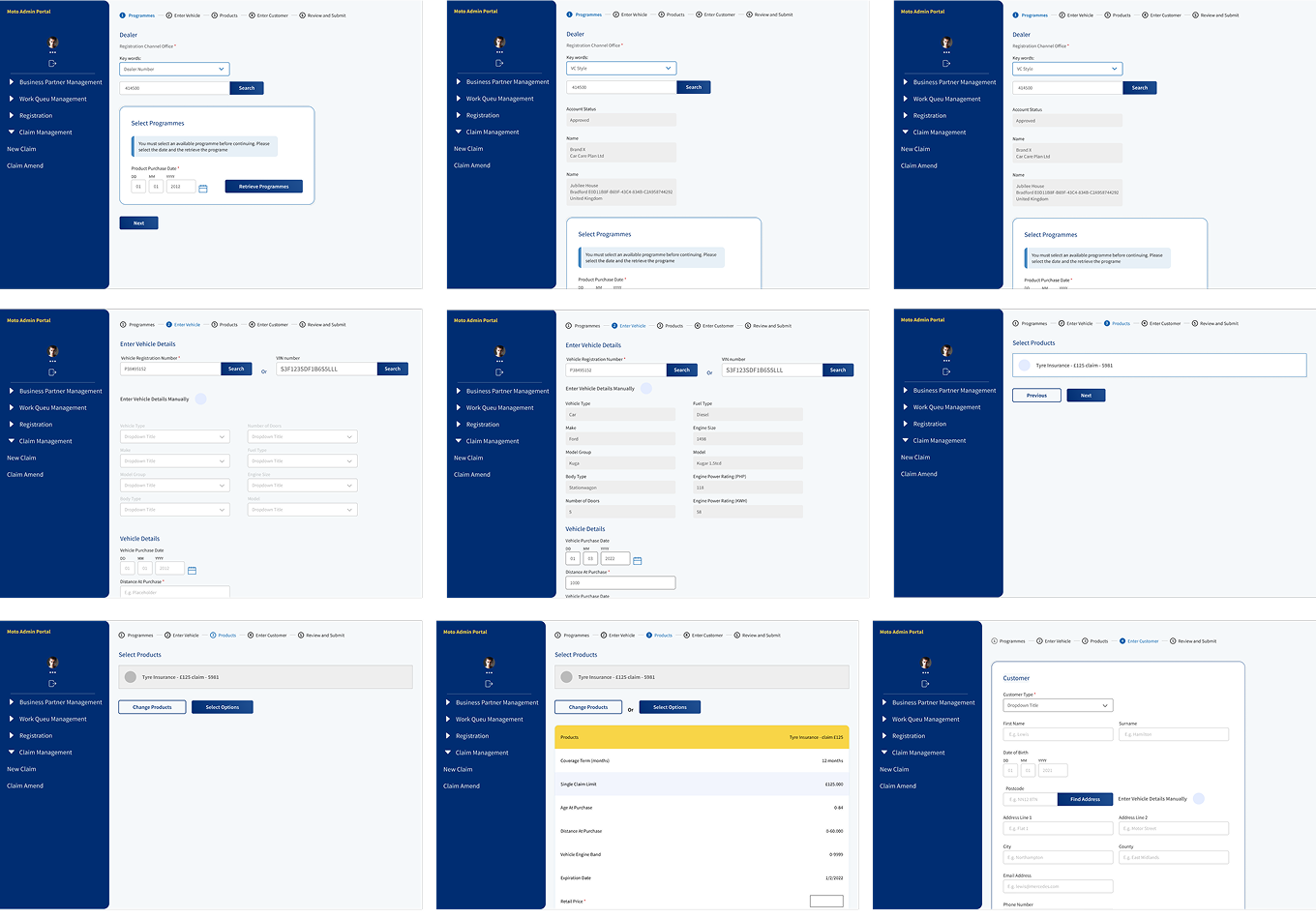
01. Insurance Add-on Flow
From paperwork to pixels - car care plan
Problem
Insurance add-ons were sold through printed forms post-car purchase — a manual, unclear process often skipped. Insurance add-ons were sold through printed forms after a car purchase. The process was manual, unclear, and often skipped.
Solution
We crafted a guided digital flow enabling users to add GAP, alloy, or cosmetic repair insurance in minutes. Clear product info, simple selection, integrated payment, and confirmation. Now, it feels like buying a product, not filling out a form.e text inside of a div block.
02. E-learning interface
Visual design that carries the content - Takeda vb-kam
Problem
The platform needed to deliver dense, information-heavy training content through a clean, engaging UI. Layouts lacked clarity, and visuals didn't support the message.
Solution
Collaborated closely with PMs to understand learning goals and structure. Focused on shaping visuals that made complex content digestible - aligning infographics, layouts, and UI elements to support information flow. Design that doesn't just look good - it helps the content land.
03. Market Performance Platform
Clarity at scale, from VOC to AI - UL solutions
Problem
Retailers and suppliers struggled to connect product data, consumer feedback, and returns meaningfully. Existing tools were fragmented, hard to navigate, making insight feel like guesswork.
Solution
Designed a platform integrating VOC, product info, and AI-driven insights into one clean, interactive system. Collaborated across teams to translate dense requirements into interfaces that surfaced what mattered most. From dashboards to dynamic graphs, every screen focused on clarity, traceability, and confident decision-making. Less noise, more signal — built for how users actually work.
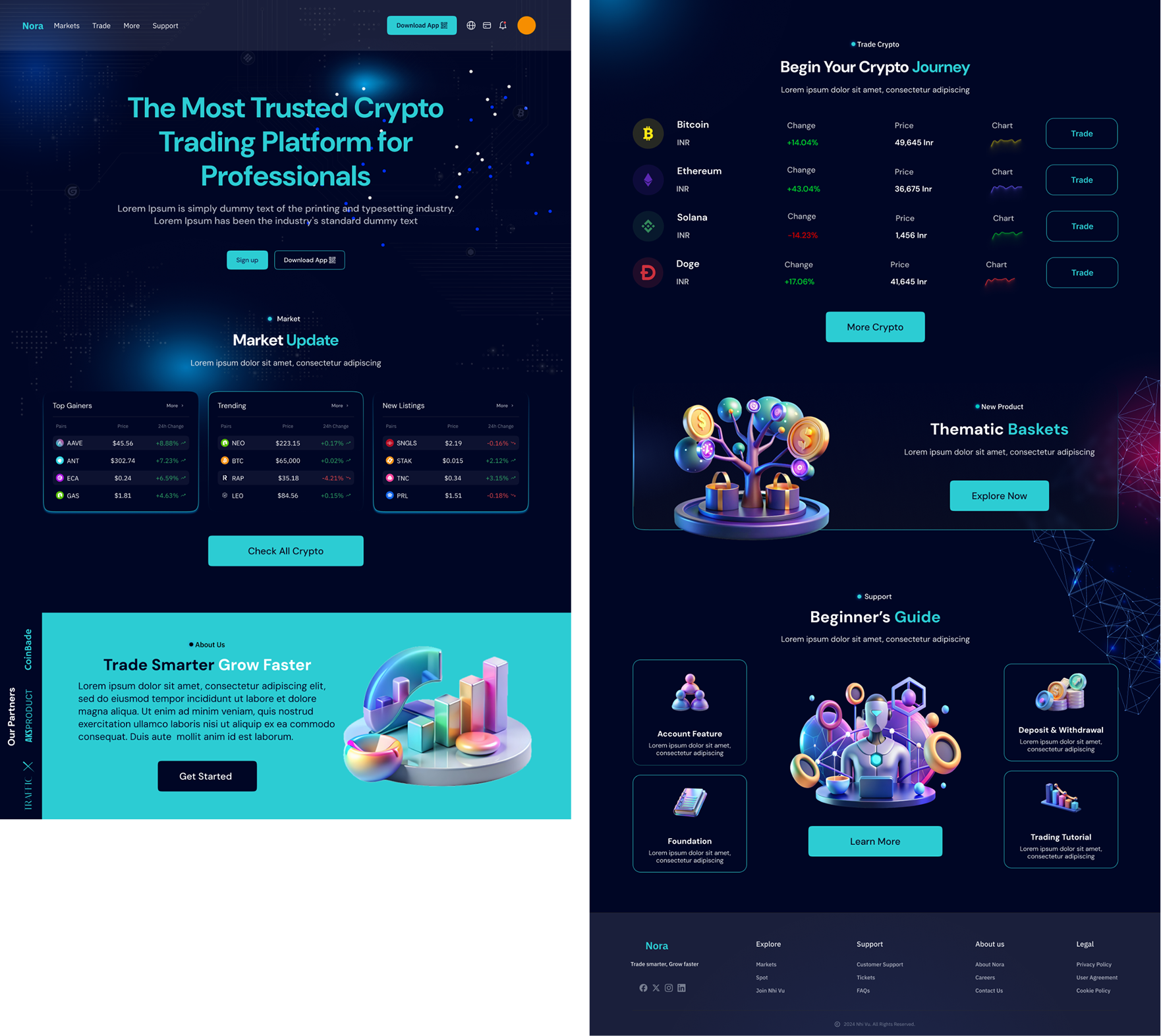
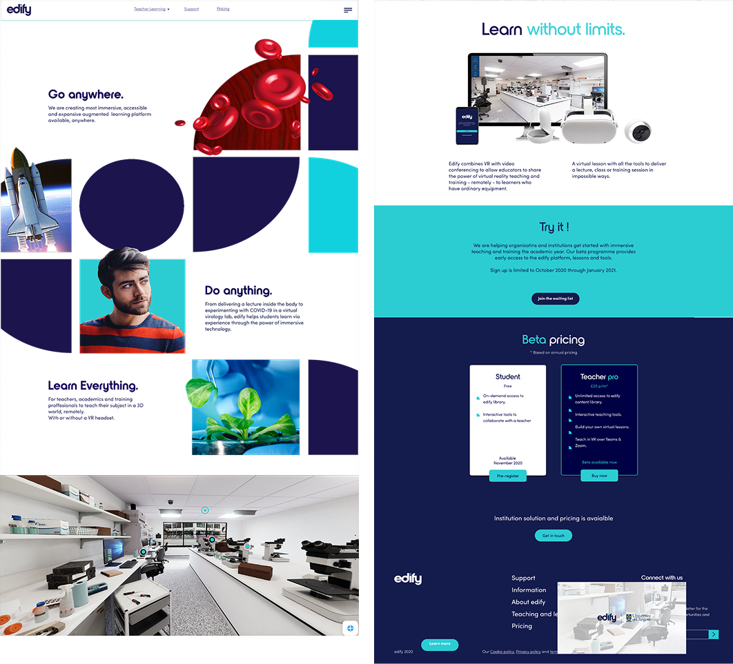
04. Marketing Website UI
Clean, cohesive interfaces with a strong visual rhythm
Overview
A series of marketing pages designed to reflect brand tone while staying sharp, functional, and user-friendly. Each layout focused on balance — clean grid structures, refined typography, considered color use, and deliberate spacing. The goal wasn’t to reinvent the wheel, but to elevate everyday brand presence with thoughtful, high-quality design. These interfaces speak in visual hierarchy, not noise.
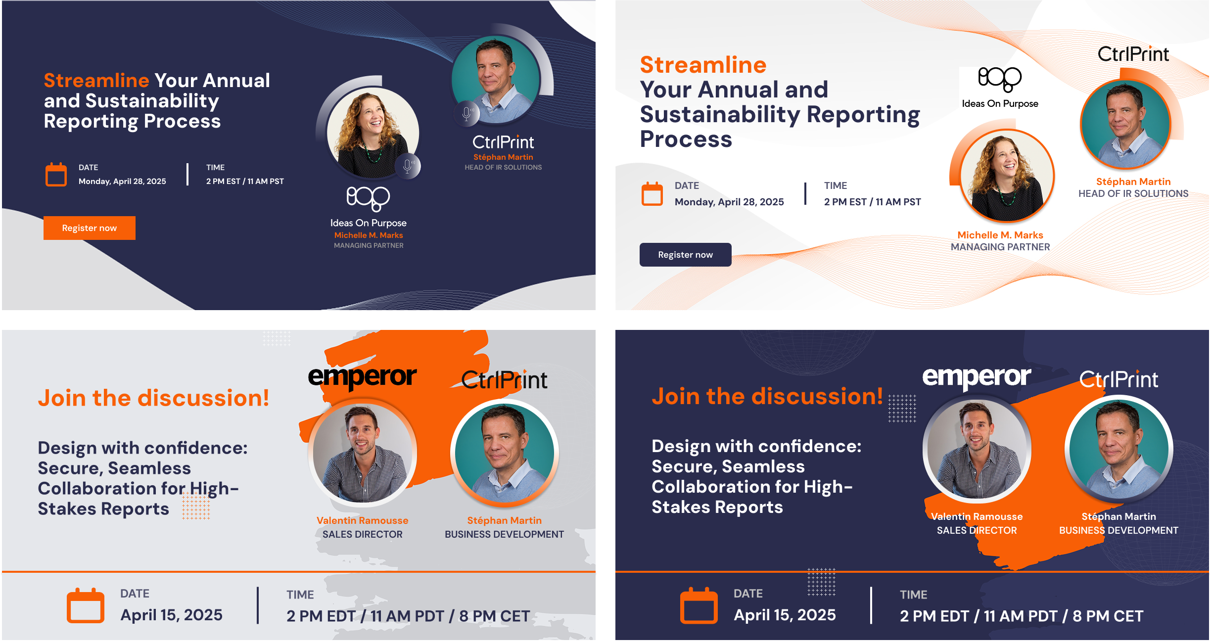
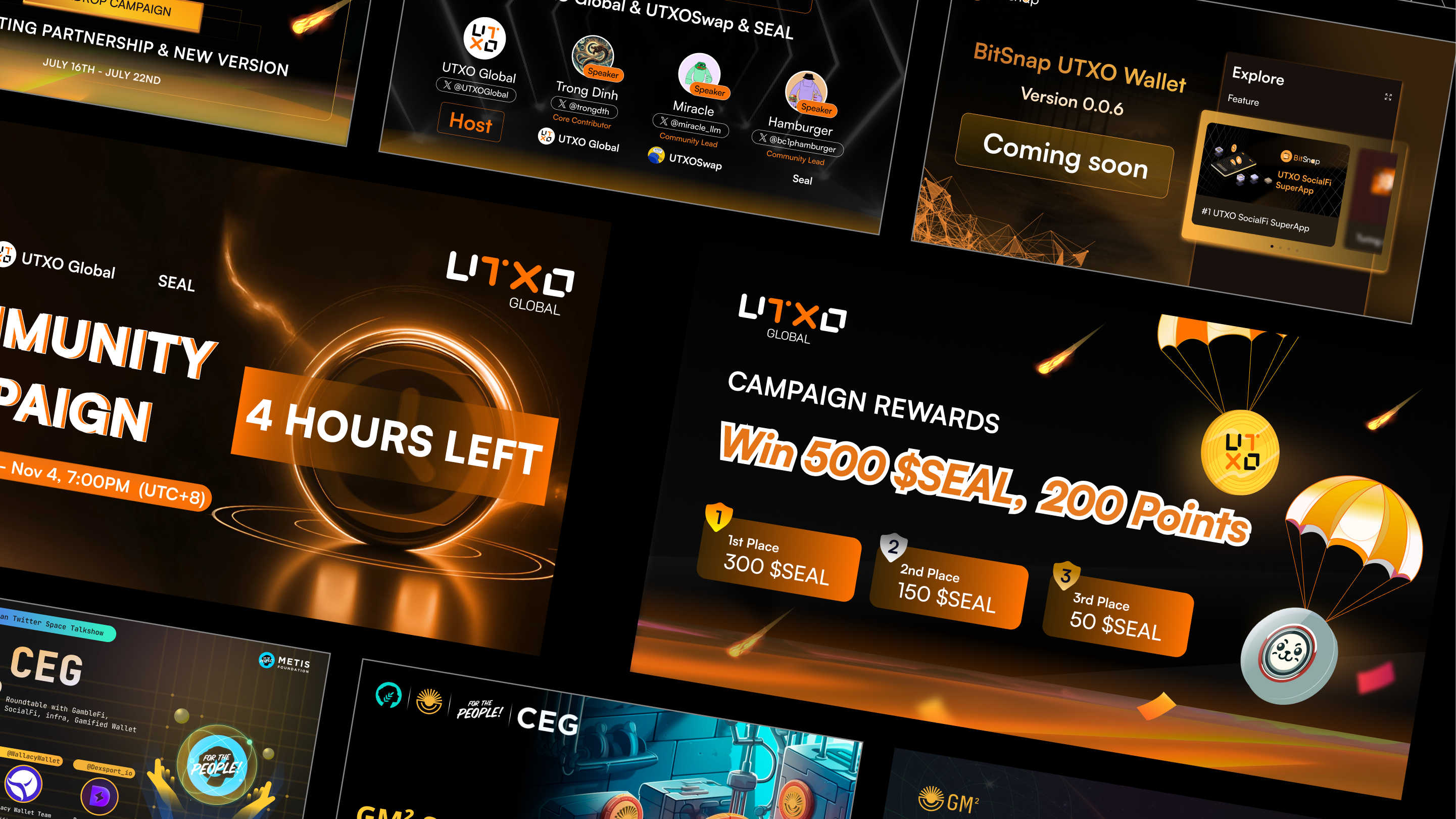
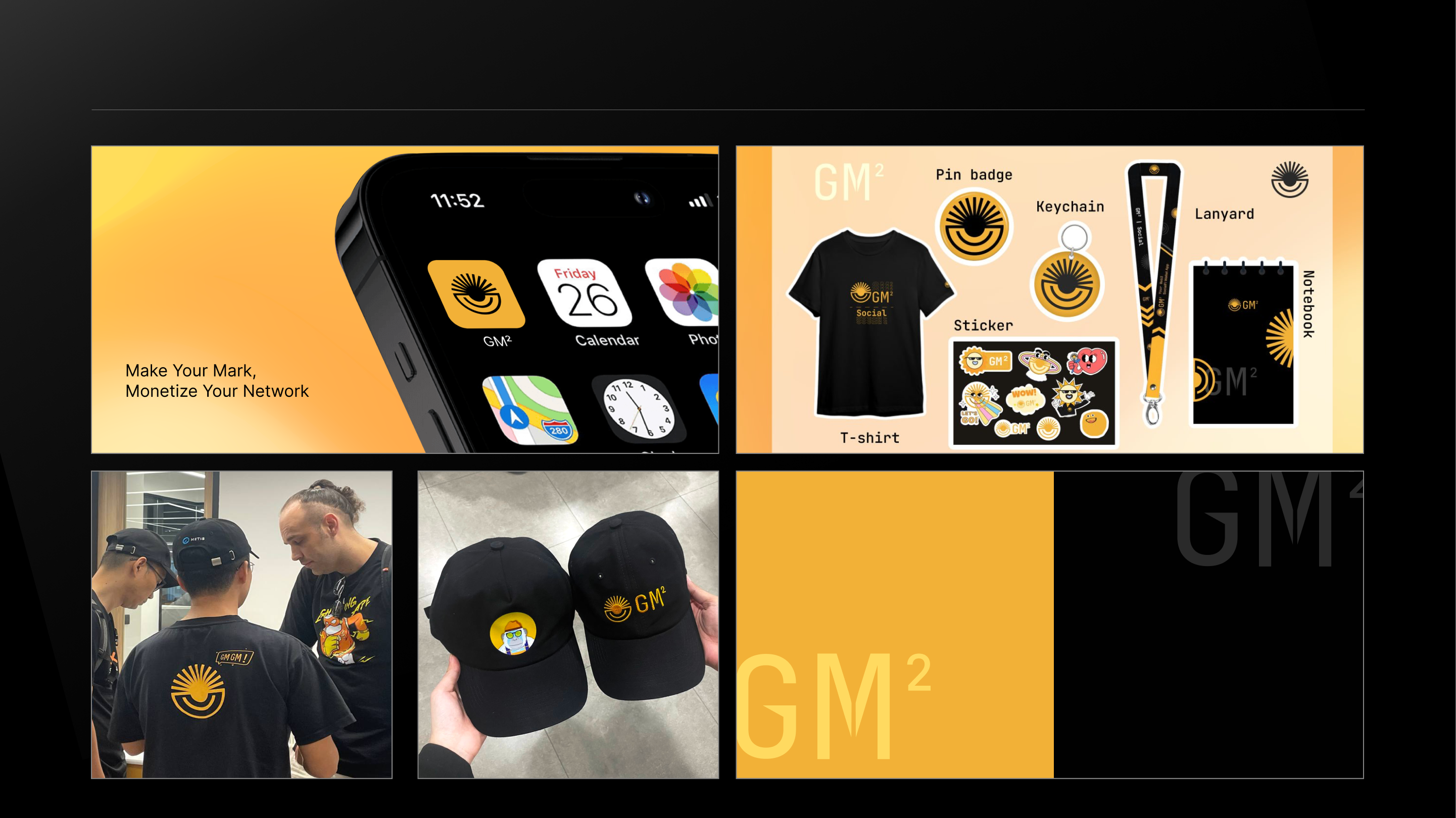
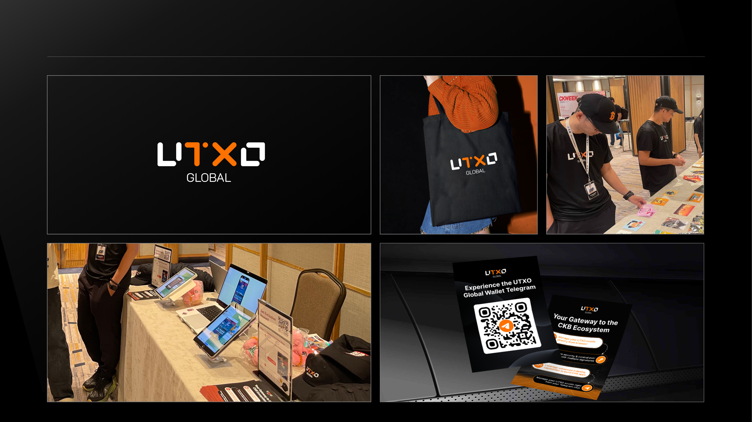
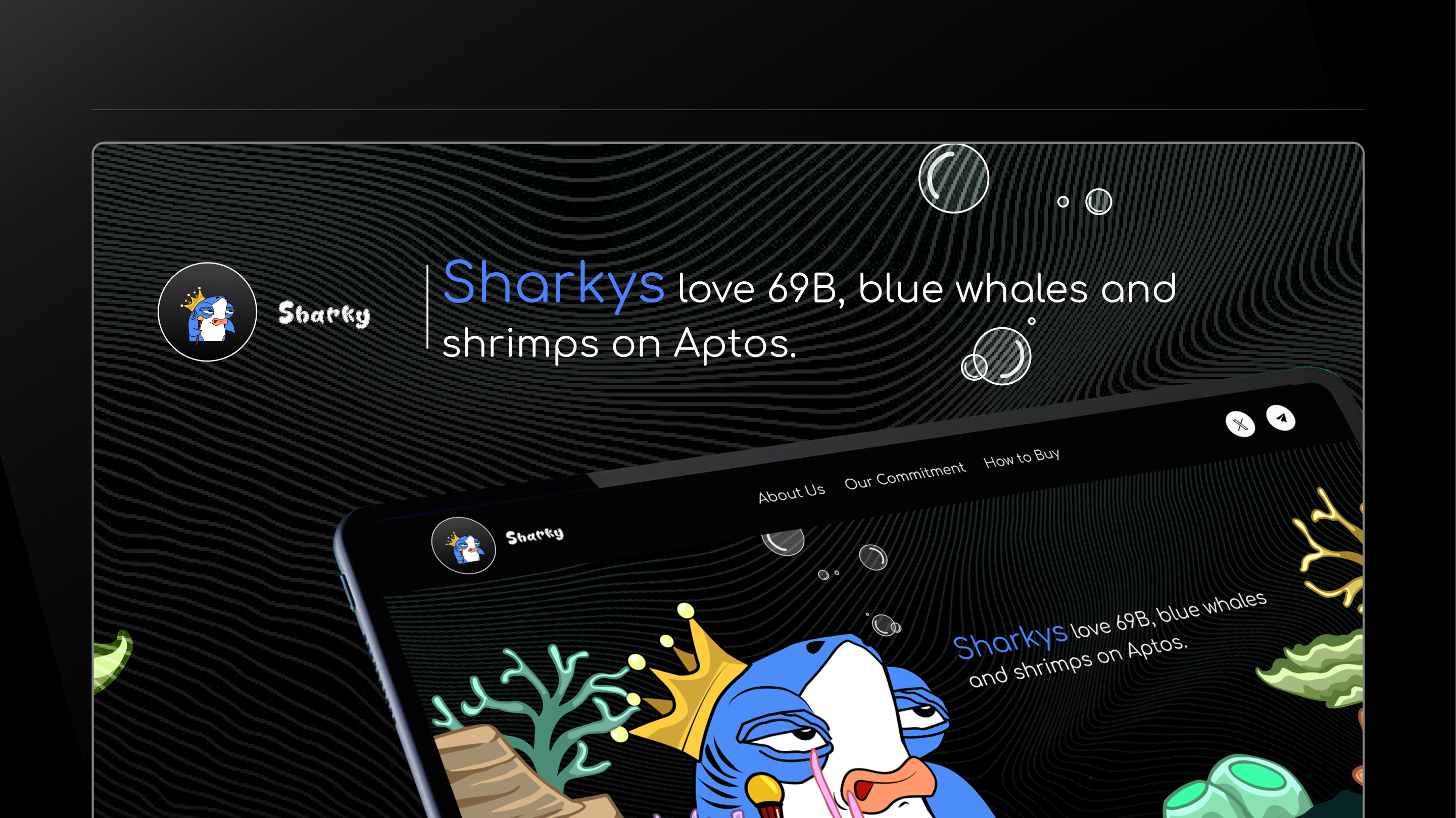
05. Graphic & Marketing Design
Bringing clarity and energy to everyday brand communication
Overview
Through a various projects, the work ranged from social media graphics and promotional materials to layout and brand visuals — often under tight timelines and minimal direction. Each piece focused on clean composition, purposeful typography, and color that communicates. Whether it was for digital ads, print, or content marketing, the goal was always the same: deliver clear, engaging design that feels both branded and alive.
.png)
.png)
_edited.png)
.avif)
.png)
.png)
.png)
.png)
.png)
_edited_edited%20(1).jpg)
%2B(1)_edited_edited.png)


.png)
